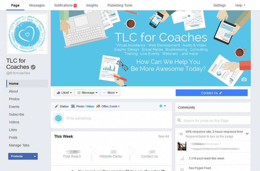
Facebook has been slowly rolling out a new Page layout for desktop users in the last month. If you have a Facebook business page or Fan Page, you may have noticed the change to the new ad-free design. Now is a good time to review your page and settings.
1. Check your cover image. The profile picture no longer overlays the cover image. In our case, we left a space on our old cover image to account for the profile picture. With the layout change, it looked a little off. So we had to update our cover image.
2. Check your tabs. They are now displayed on the left-hand side of your page and are a lot more visible than the previous design. You may want to go in and re-arrange them. If you have some old tabs that were hidden by default in the old design (simply because there wasn’t enough room for them), they might now be displaying for everyone to see. If you need to remove any 3rd party apps, go to Settings > Apps.
3. If you have a CTA or Call-To-Action button, it now more prominent on the new design under your cover image. Test it and make sure it goes where you want it to.
4. Your Page Sections are now on the right side. Make sure all your important info is still displayed there and in the order you want. Not all of them can be moved around (About, Info, Search), but if you have Photos, Events, Apps, etc, you can choose the order of those.
As always, be sure to test your page on multiple devices, not only while you’re logged in as an administrator but also while logged out as a visitor.
Want more?
Get instant access to our free online library and toolbox full of helpful time-saving ebooks, printable checklists, royalty-free graphics, training videos, templates, shareable social media images, and much more! We’re pretty confident you’ll find something useful in there that will help you build your business online!

Already a member? Awesome! Login >>

